Works > Wynteam Branding & Web > Branding
Works > Wynteam Branding & Web > Branding
Wynteam Global’s Branding doc.
Wynteam Global’s Branding doc.
Wynteam Global’s Branding doc.
Wynteam Global’s
Branding doc.
WYNTEAM needed a refreshed brand to enhance consistency, professionalism, and global appeal. The goal was to create a modern identity that reflected its expertise, collaboration, and industry leadership.
WYNTEAM needed a refreshed brand to enhance consistency, professionalism, and global appeal. The goal was to create a modern identity that reflected its expertise, collaboration, and industry leadership.
WYNTEAM needed a refreshed brand to enhance consistency, professionalism, and global appeal. The goal was to create a modern identity that reflected its expertise, collaboration, and industry leadership.
Logo design
Logo design
Logo design
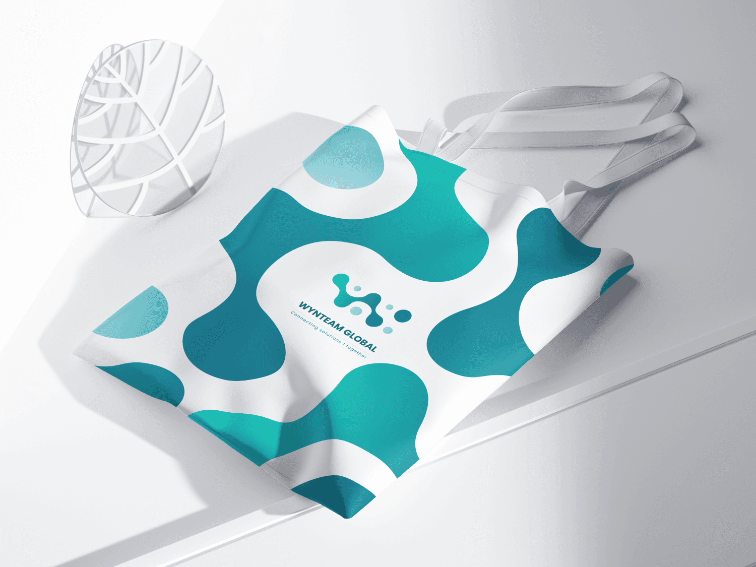
The new logo embodies WYNTEAM’s global presence, seamless collaboration, and forward-thinking approach while ensuring a strong and memorable brand identity.
The new logo embodies WYNTEAM’s global presence, seamless collaboration, and forward-thinking approach while ensuring a strong and memorable brand identity.
The new logo embodies WYNTEAM’s global presence, seamless collaboration, and forward-thinking approach while ensuring a strong and memorable brand identity.

Concept behind logo design
Concept behind logo design
Concept behind logo design
The embedded dots representing people across the globe.
The embedded dots representing people across the globe.
The embedded dots representing people across the globe.
+
The W-shaped logo symbolizes WYNTEAM’s identity.
The W-shaped logo symbolizes WYNTEAM’s identity.
The W-shaped logo symbolizes WYNTEAM’s identity.
+
The connections between the dots highlight collaboration and teamwork, reinforcing the brand’s mission of uniting talent worldwide.
The connections between the dots highlight collaboration and teamwork, reinforcing the brand’s mission of uniting talent worldwide.
The connections between the dots highlight collaboration and teamwork, reinforcing the brand’s mission of uniting talent worldwide.

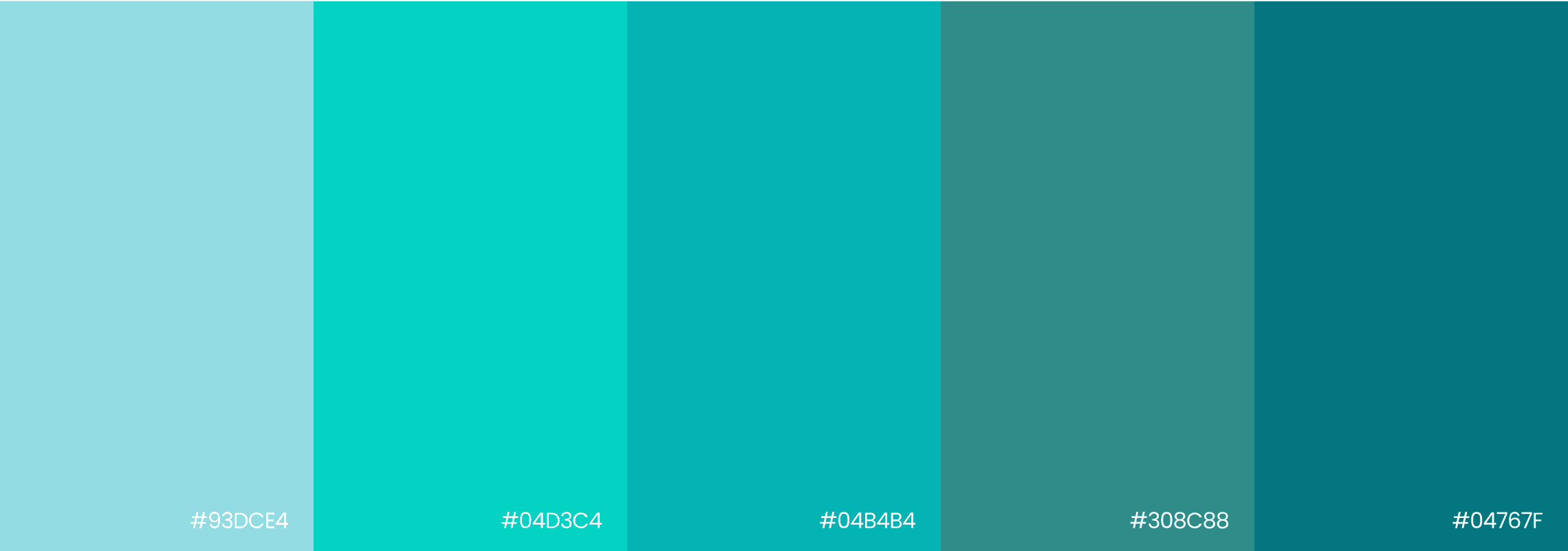
Color Palette
Color Palette
Color Palette
WYNTEAM’s color palette reflects its core values of trust, collaboration, and global connectivity.
The primary teal shade represents reliability and innovation, while the supporting aqua and deep teal tones add a dynamic, modern touch. These colors create a cohesive and professional brand presence, reinforcing WYNTEAM’s commitment to seamless solutions and global reach.
Typography
Typography
Typography
1234567890AaBbCc
!@#$%^
1234567890
AaBbCc
!@#$%^
1234567890
AaBbCc
!@#$%^
Poppins typography plays a key role in conveying WYNTEAM’s modern, professional image while ensuring readability and consistency across digital platforms.
Poppins typography plays a key role in conveying WYNTEAM’s modern, professional image while ensuring readability and consistency across digital platforms.
Poppins typography plays a key role in conveying WYNTEAM’s modern, professional image while ensuring readability and consistency across digital platforms.


